User Eccentric Returns!

After a two-and-a-half year hiatus, I’ve finally got this site back up and running! The last incarnation was running on a way-outdated version of Movable Type that was brought to its knees by all the hackers and spammers that infect the modern web, forcing me to take it down. Now I’m running WordPress, which hopefully means smooth sailing.

Actual relevant content should resume shortly.

Posted in meta | Comments Off on User Eccentric Returns!

The Four Qualities of Successful Design Researchers

In my four-plus years of being a professional design researcher, I’ve worked with a fair number of other design researchers. As part of my own professional development, I’ve reflected on what makes the great ones so great and the mediocre ones so mediocre. I’ve noticed that there are four personality traits that constantly crop up amongst the great design researchers I have known.

A great design researcher is always…

Continue reading

Posted in design research | 3 Comments

Firefox 3 Makes the Web Safer

I recently accessed my Paypal account to fork over some money to a friend for buying me a few bottles of wine. I had also recently upgraded to Firefox 3, without spending any significant amount of time looking over the new feature list, as usual. I was pleasantly surprised when the following object suddenly decorated my address bar (which I have circled in red):

Firefox authorization in the URL bar

Continue reading

Posted in interaction design | 2 Comments

Snackr Sinks Its Teeth Into Google Reader

As a side project, I’ve been helping NJ out with his Snackr AIR application. Way back when he first started building Snackr, he sent me a build and I started using it. It was exactly what I needed to get back into reading my RSS feeds again, but I still liked to read some feeds (like my friends’ blogs and others that I always wanted to be up-to-date with) in a regular feed reader client. It annoyed me that I had to maintain two clients, add new feeds to both, mark items read in both, etc. Then I thought “Hey, Google Reader has an API. Maybe we could use it to automatically keep the two clients in sync!” I badgered NJ to implement this feature but he doesn’t use a normal feed reader so it wasn’t the first thing on his priority list. Then I thought “Wait a minute, I know how to code! And I’ve always wanted to learn a little more Flex…” So I sat down to do it myself.

Now it’s four months later and I finally have something to show for it. NJ released a new test build, 0.38 TEST, which includes my Google Reader integration feature. After backing up your Snackr database and your Google Reader feed list, download the test build and let me know what you think.
Continue reading

Posted in snackr | 1 Comment

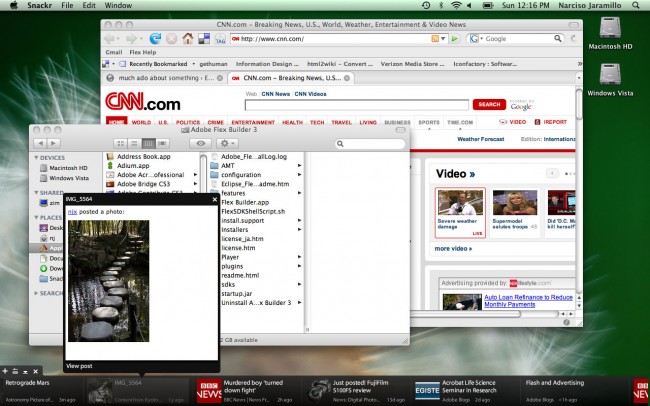
Snackr: Don’t Read Blogs, Snack On Them!

My coworker and friend NJ has created a new way to read and digest your RSS-syndicated news feeds in the form of a ticker-like desktop application built in Flex and AIR called Snackr. I’ve been using it to help him test it out for a month or two now and I have to say it’s really cool. Prior to Snackr, I read a handful of the feeds I’ve added to my reader application (mostly those written by my friends or coworkers) and mostly ignored everything else. I just never wanted to spend the time to slog through that huge backlog of news in one sitting, and since I only opened my feed reader once a day at best, I didn’t have very many sittings. But now that new feed items scroll by the bottom or side of my desktop, I can constantly glance over at the headlines and see if anything interests me. Plus it gives me something to do during a boring meeting or to kill time between tasks (although I’ll warn you – it doesn’t do much to improve your productivity!)

Snackr

Continue reading

Posted in snackr | 5 Comments

A Pattern Library for Information Design

I’m not usually one to recycle links, but this pattern library for information design was too good to pass up. Christian Behrens catalogs around 55 different ways to display information that helps application designers and others go beyond blasé bar and pie charts when a different visualization would be more appropriate. As I covered in the FIG section on Information Design, it’s important to spend time getting content displays right by thinking of them as information design problems. This website helps us get better at that by giving us some concrete new tools and techniques to play around with. I’ll definitely be keeping it around to refer to later.

Found via Ethan Eismann.

Posted in interaction design | 1 Comment

Thermo: The Board Game

As many of you may know, I’m currently hard at work on Thermo (demo video), our next generation RIA design tool, along with the rest of the design team. I wanted to share one of the research techniques we’ve used that’s proven to be quite effective.
Continue reading

Posted in design research, flash catalyst | 7 Comments

Excellent Example of Eliminating Work

Yesterday’s xkcd demonstrates a FIG best practice in action:

xkcd overzealous autoconfig

Although one might quibble with it’s means, the Wifi autoconfig program depicted here does an excellent job of following the FIG best practice “Use the impeccable memory and powerful processing abilities of computers to eliminate work for your users.” More systems should attempt to follow this autoconfig program’s good example.

Posted in interaction design | Comments Off on Excellent Example of Eliminating Work

FIG Evaluation – The New Dilbert.com

(Disclaimer – as always, the opinions expressed below are my own and are not necessarily shared by my employer.)

Dilbert.com recently relaunched with a new site design that uses primarily Flash. Good technology choice. Unfortunately, it seems to have gone downhill from there.

The new design has received quite a bit of negative user feedback, and much of this is quite justifiable. The new Dilbert may use Flash, but it uses it in many of the wrong ways.

Continue reading

Posted in flex interface guide, interaction design | 2 Comments

enabled=”false” Considered Harmful

Oftentimes when designing applications, certain functionality needs to be present in some situations but not in others. The traditional way of dealing with this on the desktop is to enable the controls that provide access to that functionality when it is available and to disable them when it is not. For example, consider the following application snippet where the “Merge” function only applies when the user has selected two records.

Unfortunately, disabling controls without explanation is often a pathway to confusing your users. The problem is that disabling a control does not, by itself, provide the user with any indication of why the control is disabled. It may seem obvious to us, the system’s designers/developers, but to a new user experimenting with the application’s functions the reason the control is disabled may be quite opaque, especially if the function is far away from the means of enabling it (e.g., with application menu items). Time and again in user testing, I’ve watched participants fumble when a function they were expecting to be able to perform is inexplicably disabled.
Continue reading

Posted in interaction design | 7 Comments