(Disclaimer – as always, the opinions expressed below are my own and are not necessarily shared by my employer.)
Dilbert.com recently relaunched with a new site design that uses primarily Flash. Good technology choice. Unfortunately, it seems to have gone downhill from there.
The new design has received quite a bit of negative user feedback, and much of this is quite justifiable. The new Dilbert may use Flash, but it uses it in many of the wrong ways.

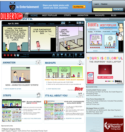
First off, notice the fairly small amount of screen real estate devoted to the content the user cares about (the comic strip itself). Only one strip, today’s, appears in a fairly small box – the rest of the screen is given to ads and overly elaborate navigation. What’s worse, the Sunday comic (which has always been larger than the weekday strips) is still crammed into the same small box! To see the whole strip, the user must use arrows to scroll from frame to frame, a ridiculous amount of navigation excise!
The Dilbert.com designers had an opportunity to make the site more effective at viewing and browsing the comic strips than was the old, fairly clunky HTML site. For example, they could have implemented smarts that recognized the last time the user had visited Dilbert.com and displayed all the comics he hadn’t yet seen. They could have provided filtering tools that gave users easier access to the archives, or allowed them to view top rated comics without navigating to a new screen. The new “Mashups” feature could have been implemented in-place by clicking on the comic to modify the last panel instead of creating a whole new screen and scattering the main page with navigation links. Sadly, the design team dropped the ball and chose to create a traditional HTML application with a sprinkling of animation.
Speaking of animation, the new site design uses motion in all the wrong ways. For the first week it was launched, there was a continuously playing movie plopped in the lower-left corner of the screen. This is almost always a bad idea – continuously playing animations distract the user from main content. They’re annoying and they often don’t even serve their intended purpose of drawing the user’s attention; most web users have been “trained” to ignore animation since they equate it with useless banner ads. This was quickly removed, fortunately, but the site still uses motion gratuitously. Text bounces and icons jump, but the design never employs motion to help users understand the structure of the site, how to explore their content, or how to accomplish their goals. The ability to employ motion to help guide users through the site is one of the biggest advantages Flash gives to designers, but Dilbert.com fails to take advantage of it.
On the positive side, the site does do a good job of preserving web idioms such as bookmarking and back button support, something many Flash sites fail to achieve. The site designers seem very familiar with traditional HTML website design, which served them well when managing URLs but poorly when designing the actual screens and navigation structure.
Overall evaluation: Thumbs down.
Dilbert.com – List of broken FIG best practices
- Eliminate unnecessary navigation in your applications.
- Integrate highly related information into a single content display whenever possible.
- Avoid splitting information across multiple screens or states.
- Only use page-to-page transitions when the user is pursuing a clearly different goal.
- Use intra-screen changes to modify the screen as the user advances through tasks that are related to the same goal.
- Employ sound visual hierarchy to communicate the important elements on the page and to guide the user’s eyes to the next part of their task.
- Make it easy for users to not just find content, but explore content.
- Display controls in the context of the content they manipulate.
- Avoid gimmicky or gratuitous motion
- Employ motion to apply physical principles that help users understand the workings of your application
- Use the impeccable memory and powerful processing abilities of computers to eliminate work for your users.
- Discover your users’ real tasks to better understand what flows you must make more efficient.

2 Responses to FIG Evaluation – The New Dilbert.com